At the moment, two of my favourite directors are Damien Chazelle and Wes Anderson. Though heavily different in genre, the definite focus of their films and choices in cinematography draw me to their films.
The often abstract nature of Wes Anderson's films has allowed them to develop their own independent style beyond the conventions of established cinema. The random, abrupt straight cuts between shots and often absence of long takes is directly reflected in the development of characters. The only way I can really describe Anderson's work is bizarre. The vibrancy of colour palette and subverting of film conventions is consistent in his work. His 2012 feature Moonrise Kingdom and The Grand Budapest Hotel of 2014 are both told to the audience by a narrator. Not an omniscient narrator but one active in the plot, breaking the so called fourth wall.
Real, meaningful character relationships are developed on the most surreal backdrop. Anderson cleverly balances both comedy and drama. One key channel for this in The Grand Budapest Hotel, in my opinion, is the relationship between M. Gustave and Zero.The immense shot variety is what I love about these films (alongside the abundance of quirky characters). Constant change of perspective and audience positioning fully immerses them in the story. For me, I feel like a fly on the wall watching the events unfold whilst other times(particularly in Moonrise Kingdom) I feel like one of the characters in the film. The opening to Moonrise Kingdom sees a fluid pan across a house, room to room almost like a dolls house. This is followed by close ups, POV shots, shot reverse shot, any shot you can think of!!!
Wednesday, 12 April 2017
Shot Variety
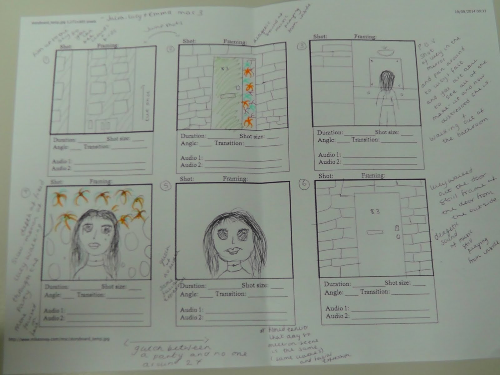
When first planning and storyboarding our opening, I wanted to follow the rough outline of conventional shot sequences however use rapid straight cuts between varying shots to capture the emotional intensity we decided upon.
Dazed begins with a tilt shot into the opening establishing shot of the block of flats displaying the title itself. In the following party sequence we used consistent (extreme) close ups in the glitch sequence before contrasting to the full body and POV running sequence. The obscurity of the protagonist was emphasised through choices in cinematography in the section filmed on the roof. Though planned later on, we had a variation of over the shoulder, POV and close up shots countered by a wide shot zooming out to end the opening. As well as this we explored camera angles as well with as low and high angle shots whereas previously a substantial amount of the opening was filmed at eye level.
Tuesday, 11 April 2017
Colour Palette
As mentioned in my blog post about the television series Glue, we wanted and did explore coloured lighting to connote the excitement of teen life. Not only this, it enhanced the verisimilitude of one of the first and arguably most crucial shots of the opening - the party. Bright neon colours allowed us to explore contrast and like many indie films, high colour saturation was key.
More simply, the opening was split into two key parts with differing colour palettes. The second is much more grey and dull, filmed on quite a harsh urban background.
Title Choice
Initially we decided upon the title Daze, however as we began to give even more focus to the protagonist we changed it to Dazed. The verb choice is therefore a direct reflection of the confusion and almost hypnotised state of the character in our opening.
Like many real film products the choice for a single word title is ambiguous, giving very little detail as to style or content. Some recent examples are Life, Unforgettable, Unlocked and Suntan (all for 2017 release). Most crucially, we kept with the our main focus of replicated the titles of Drive.
The title, I feel, reflects the frantic nature of the opening whereby the audience is immediately positioned from the same perspective as the protagonist. However, the absence of dialogue places the audience in the same 'dazed' position in their lack of knowledge.
Like many real film products the choice for a single word title is ambiguous, giving very little detail as to style or content. Some recent examples are Life, Unforgettable, Unlocked and Suntan (all for 2017 release). Most crucially, we kept with the our main focus of replicated the titles of Drive.
The title, I feel, reflects the frantic nature of the opening whereby the audience is immediately positioned from the same perspective as the protagonist. However, the absence of dialogue places the audience in the same 'dazed' position in their lack of knowledge.
Monday, 10 April 2017
Location
In keeping with our desired focus on the challenges and overwhelming nature of young life we decided to film in largely built up urban areas. We had two main locations, filming in low light at the blocks of flats and then in the high key daylight on the roof. The busy streets and loud diegetic sound allowed us to further our desire to reflect the panic and often obscurity of the protagonist in the landscape.
However, in deciding to film at low light levels to fulfill our desire for stark contrasts, we had to pay even closer attention to whether everything was clear in frame. As well as this, filming on a road continually disrupted takes but eventually we filmed the entire running sequence.
Sunday, 9 April 2017
Evaluation: Question One Script
1) In what ways does your media product use, develop or
challenge forms and conventions of real media products?
"Our opening for Dazed conforms to numerous conventions of established
film products, namely the 2011 feature Drive. The stark contrast between the
bright pink lettering of the titles with the darker content enabled us to
harbour discomfort from the audience, which we furthered through uncomfortable ringing
sounds edited over black screens. The use of such black screens was also
inspired by Drive but arguably used more consistently in our opening in comparison.
I also found this contrast in content to be similar in the 2017 horror film Get
Out. Also, we adapted the text displaying the days of the week in Seven (1995) to suit our desired style thus developing the form used.
Our choice for an almost complete absence of dialogue is a
convention typical of modern cinema however our choice for a single line of
dialogue partially challenges such. The somewhat inconsistency of shot length
in between the black screens and often enhanced diegetic sound was directly
linked to our focus on the young protagonist. Character driven plots and establishing a perspective
is pivotal in any opening though we intentionally over played it so the
audience is immediately invested in the protagonist. The unreliable narrator is
a common motif of thriller novels and is something I’d love to explore as seen
in Gone Girl, adapted to film in 2014."Sunday, 2 April 2017
Get Out Opening
I recently went to see the film Get Out, categorised by IMDb as a horror/mystery. The film itself is largely psychological with sudden shocks assisted by orchestral music as opposed to the more typical trope of the devil for example in the horror genre. In my opinion the film was more of a mystery thriller and even though the later part of the plot wasn't really the type of cinema I enjoy, the cinematography was interesting.
The opening of the film drew similarities to our opening whereby the style of the titles themselves is a sort of contradiction to the content of the film. Judging the bright color palette and blue simple style of the titles in isolation, the film conforms to the style of indie films. In doing so, as we had hoped for our film, the audience is in a false sense of security before the tone changes (in this case where the car hits a deer).
Throughout the film, director Jordan Peele explores use of extreme close ups to create emotional intensity as we had done in our opening.
The opening of the film drew similarities to our opening whereby the style of the titles themselves is a sort of contradiction to the content of the film. Judging the bright color palette and blue simple style of the titles in isolation, the film conforms to the style of indie films. In doing so, as we had hoped for our film, the audience is in a false sense of security before the tone changes (in this case where the car hits a deer).
Throughout the film, director Jordan Peele explores use of extreme close ups to create emotional intensity as we had done in our opening.
Subscribe to:
Posts (Atom)